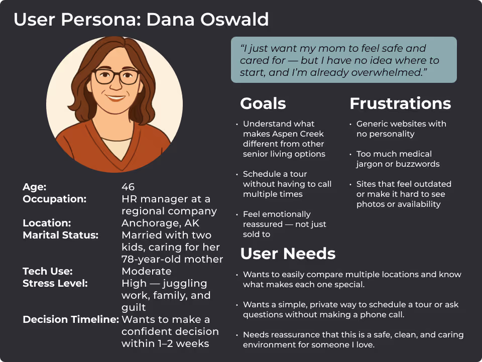
Redefining Comfort & Care Online

Improving UX for Seniors and Families Across Four Assisted Living Facilities

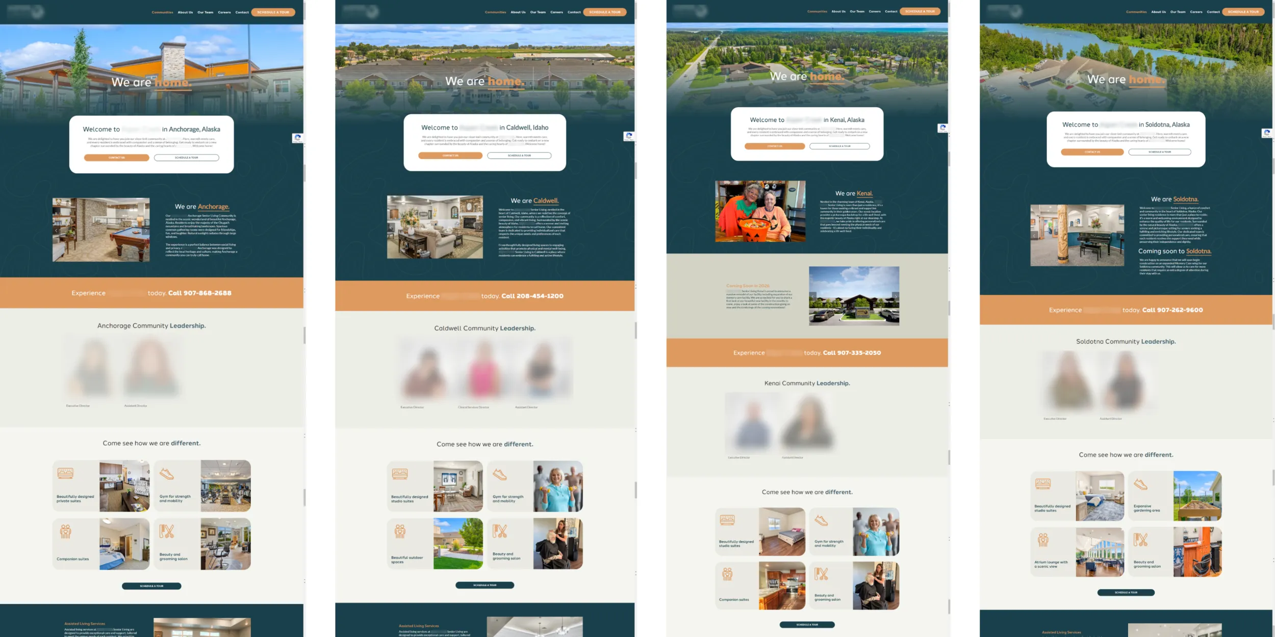
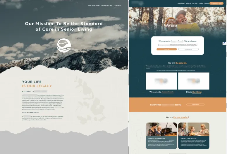
Aspen Creek operates four senior living facilities across Alaska and Idaho, each with distinct offerings in assisted living, memory care, and transitional support. While their original website featured informative content and branding, it lacked UX structure, accessibility safeguards, and strong calls to action—making it difficult for families to confidently explore care options or book visits.

I led full-site development in collaboration with the design team, and six months later, returned for a focused UX revamp. The goal: increase tour bookings, simplify user flows, and better support seniors and caregivers making high-stakes decisions under pressure. We achieved this by repositioning CTAs, streamlining navigation, and improving performance and accessibility across devices.

Senior Living site home page showing on laptop screen. Laptop sits on wood desk with cup of coffee and wildflowers near it.

Discovery & Research

The project began with a careful audit of the existing website and early design concepts. While the visuals were warm and inviting, user recordings and analytics made it clear that essential information, like how to book a tour or apply, was often hidden behind too many clicks. We also identified inconsistencies in the way each facility’s details were presented, which created confusion and extra calls to staff.

In parallel, we reviewed competitor sites and gathered direct feedback from families who had recently chosen a facility. This helped us understand how stressful the process could feel and where simple adjustments—like clarifying services or streamlining navigation—could make a meaningful difference. These insights shaped every decision, from layout structure to the tone of calls to action.

Understanding the Audience

From early design rounds to post-launch UX reviews, it was clear that our audience included two primary users: older adults navigating the site themselves and family caregivers searching under emotional strain. Our goal was to build a reassuring experience grounded in clarity, empathy, and ease of use.

User Persona image describing goals, frustrations and needs for the website.

Streamlining Navigation & CTA Flow

Six months after launch, click tracking revealed major drop-offs on tour and application pages. Many CTAs were buried or inconsistently placed. I led a revamp focused on shortening the path to action and reducing layout friction—especially on mobile.

We moved “Book a Tour” and “Apply Now” CTAs to the top of relevant pages, added persistent buttons to the header and footer, and simplified page structure for scanning.

Side-by-side comparison of the original home page vs the new home page with more visible navigation and calls to action.

Accessibility, Performance, & Emotional Design

Streaming video tours and high-resolution imagery were essential—but posed technical risks. To maintain a smooth experience for older users on slower connections, I optimized all videos via lazy loading and CDN delivery.

We also increased type contrast, font size, and simplified navigation paths. Each facility’s page now combines high-quality visuals with large clickable targets, accessible text, and consistent layout cues to ease the emotional weight of navigating care choices.

Image of Video tours as well as tour booking call to action.

Outcomes

Increased Tour Bookings
After repositioning CTAs, staff reported more direct inquiries and scheduled tours, indicating the importance of clear calls to action.
Improved Accessibility & User Satisfaction
Reduced confusion and CTA misses based on Mouseflow and staff feedback
Engaging Virtual Experience
Stronger content navigation, more complete applications submitted.
Scalable Framework
With the new, streamlined structure, the client can easily add or update facility details, incorporate testimonial videos, or roll out new services.

Personal Growth

This project reminded me that user experience isn’t just about performance or design—it’s also about emotional timing, clarity, and support. Creating a site that helped families during moments of difficult decision-making was deeply rewarding.